Note
Go to the end to download the full example code or to run this example in your browser via Binder.
Explore and visualize region properties with pandas#
This toy example shows how to compute the size of every labelled region in a series of 10 images. We use 2D images and then 3D images. The blob-like regions are generated synthetically. As the volume fraction (i.e., ratio of pixels or voxels covered by the blobs) increases, the number of blobs (regions) decreases, and the size (area or volume) of a single region can get larger and larger. The area (size) values are available in a pandas-compatible format, which makes for convenient data analysis and visualization.
Besides area, many other region properties are available.
import matplotlib.pyplot as plt
import numpy as np
import pandas as pd
import seaborn as sns

from skimage import data, measure


fractions = np.linspace(0.05, 0.5, 10)
2D images#
images = [data.binary_blobs(volume_fraction=f) for f in fractions]

labeled_images = [measure.label(image) for image in images]

properties = ['label', 'area']

tables = [
    measure.regionprops_table(image, properties=properties) for image in labeled_images
]
tables = [pd.DataFrame(table) for table in tables]

for fraction, table in zip(fractions, tables):
    table['volume fraction'] = fraction

areas = pd.concat(tables, axis=0)

# Create custom grid of subplots
grid = plt.GridSpec(2, 2)
ax1 = plt.subplot(grid[0, 0])
ax2 = plt.subplot(grid[0, 1])
ax = plt.subplot(grid[1, :])
# Show image with lowest volume fraction
ax1.imshow(images[0], cmap='gray_r')
ax1.set_axis_off()
ax1.set_title(f'fraction {fractions[0]}')
# Show image with highest volume fraction
ax2.imshow(images[-1], cmap='gray_r')
ax2.set_axis_off()
ax2.set_title(f'fraction {fractions[-1]}')
# Plot area vs volume fraction
areas.plot(x='volume fraction', y='area', kind='scatter', ax=ax)
plt.show()
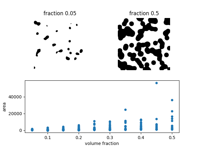
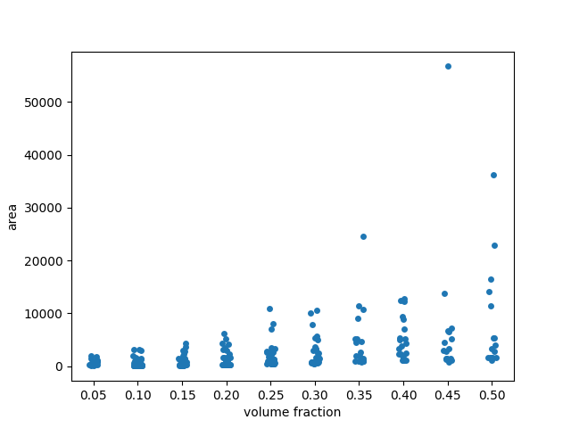
In the scatterplot, many points seem to be overlapping at low area values.
To get a better sense of the distribution, we may want to add some ‘jitter’
to the visualization. To this end, we use seaborn.stripplot (from
seaborn library for statistical data visualization)
with argument jitter=True.
fig, ax = plt.subplots()
sns.stripplot(x='volume fraction', y='area', data=areas, jitter=True, ax=ax)
# Fix floating point rendering
ax.set_xticklabels([f'{frac:.2f}' for frac in fractions])
plt.show()
/home/runner/work/scikit-image/scikit-image/doc/examples/segmentation/plot_regionprops_table.py:75: UserWarning:

set_ticklabels() should only be used with a fixed number of ticks, i.e. after set_ticks() or using a FixedLocator.
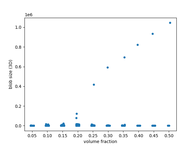
3D images#
Doing the same analysis in 3D, we find a much more dramatic behaviour: blobs coalesce into a single, giant piece as the volume fraction crosses ~0.25. This corresponds to the percolation threshold in statistical physics and graph theory.
images = [data.binary_blobs(length=128, n_dim=3, volume_fraction=f) for f in fractions]

labeled_images = [measure.label(image) for image in images]

properties = ['label', 'area']

tables = [
    measure.regionprops_table(image, properties=properties) for image in labeled_images
]
tables = [pd.DataFrame(table) for table in tables]

for fraction, table in zip(fractions, tables):
    table['volume fraction'] = fraction

blob_volumes = pd.concat(tables, axis=0)

fig, ax = plt.subplots()
sns.stripplot(x='volume fraction', y='area', data=blob_volumes, jitter=True, ax=ax)
ax.set_ylabel('blob size (3D)')
# Fix floating point rendering
ax.set_xticklabels([f'{frac:.2f}' for frac in fractions])
plt.show()
/home/runner/work/scikit-image/scikit-image/doc/examples/segmentation/plot_regionprops_table.py:107: UserWarning:

set_ticklabels() should only be used with a fixed number of ticks, i.e. after set_ticks() or using a FixedLocator.
Total running time of the script: (0 minutes 2.588 seconds)