Note
Go to the end to download the full example code or to run this example in your browser via Binder
RAG Thresholding#
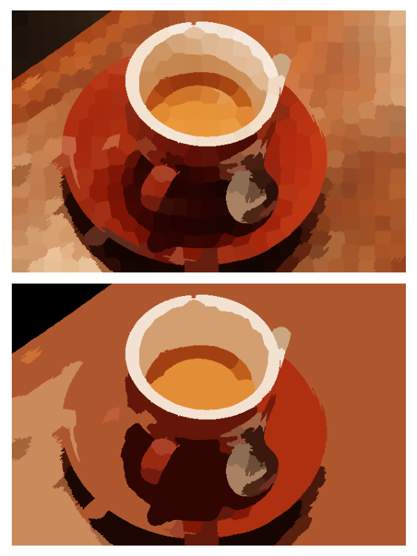
This example constructs a Region Adjacency Graph (RAG) and merges regions which are similar in color. We construct a RAG and define edges as the difference in mean color. We then join regions with similar mean color.
from skimage import data, segmentation, color
from skimage import graph
from matplotlib import pyplot as plt


img = data.coffee()

labels1 = segmentation.slic(img, compactness=30, n_segments=400, start_label=1)
out1 = color.label2rgb(labels1, img, kind='avg', bg_label=0)

g = graph.rag_mean_color(img, labels1)
labels2 = graph.cut_threshold(labels1, g, 29)
out2 = color.label2rgb(labels2, img, kind='avg', bg_label=0)

fig, ax = plt.subplots(nrows=2, sharex=True, sharey=True,
                       figsize=(6, 8))

ax[0].imshow(out1)
ax[1].imshow(out2)

for a in ax:
    a.axis('off')

plt.tight_layout()
Total running time of the script: ( 0 minutes 2.397 seconds)